Climate Change
&
Other Superstitions1.
C. (Kees) le Pair
|
Abstract
|
Good evening ladies,
I feel honored to be invited to talk to you about climate change.
Let me first apologise for my English. Several years ago I read a story to my grandson.
He himself had just acquired the abillity to read. After I finished, he asked, whether
this time he could read me one? He picked up a book with English fairy tales, took a
deep breath and looked at me somewhat puzzled. Then he said: ìGranddad, I think your
English is not so good. Shall I read it to you in Dutch?î Which, to my surprise, he did!
I am afraid that since that time my language skills have not much improved.
Climate change is on everybodyís lips. The temperature of the earth is rising, polar ice melts, glaciers shorten, the sea level rises and the CO2-concentration in the atmosphere increases. Everybody knows this. I have a convincing slide to illustrate that phenomenon:

Governments ponder, make bold statements and take some measures.
Private businesses adjust their pr-strategy. They offer endless new products and services
allowing us to reduce our CO2ñemissions and so help to
save the earth. Because, when ëclimate changeí is mentioned, what we really mean is:
man-made, or antropogenic climate change. It is our fault!
Scientists supposedly 'are unanimous' about the dangers that lay ahead and mr. Al Gore in the USA,
together with the IPCC received the Nobel Peace Price for telling us that the sea will
rise by 5 ñ 7 m and that the temperature will go up some 5-6 oC
this century. By the way,
the Norwegian Parliament who decides about the prize, does not have members who are
climate scientists or geologists. ( Mr. Al Gore earns his living in the
CO2 emission trade. In a few years billions of dollars will
go from bank to bank and from country to country ñ with a nice trickle in private pockets
ñ to buy and sell rights to dump or produce the gas. It is a rather airy type of trade,
but like the earlier traffic in indulgences, very profitable.)
I bet, most of you are worried about the climate as well. And if you should forget your
responsibillities for a moment, friends, neighbours, children, newspapers, TV or the government
will immediately remind you of them.
To be honest, I tell you in advance, I am not convinced that mankind is responsible for the phenomena
we perceive and more over, I do not think that the changes, which we see, are as bad, or
as dangerous as is being portrayed. The scientific world is not so unanimous about the climate
as governments, newspapers and other public media assume. For instance at the last
International Geological Conference in August 2008, there was NOT ONE (!) scientist
who had a positive view on the reports issued by the IPCC, the International Panel
on Climate Change, set up by the UN. The IPCC is the main source of the climate alarm.
This panel is composed of civil servants, lawyers, economists and a few scattered climate
scientists. It claims to study and to evaluate all significant research on the climate,
done world wide. It draws its conclusions from those findings. But in numerous instances
it has been proven that the panel neglected or ignored serious studies contradicting the
IPCCís main message (that says: ìAlarm, we heat ourselves up!î)
In the mean time there are thousands of scientists, world wide, who disagree with the
conclusions and with a series of supposed facts presented by the IPCC.
I shall show you some of the most important findings,
doubts and contradictions.
The IPCC informs us that the mean temperature of the earth, sea and lower atmosphere has risen
0,6 oC over the period from 1860 till now. Around 1860 the first reliable
measurements of temperature were made in the UK, Holland, France and a few other places.
What does the IPCC mean by 'the temperature of the earth'?
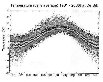
If we look at just one place on earth say: the Dutch Met-office, KNMI, located in De Bilt, and we measure the daily average temperature during the period 1901 ñ 2008 we get the above picture. Can you imagine, what it would look like, if you added similar data for many other places on earth? Of course, you can add it all up and divide by the number of measurements and say: ìthis is the mean temperatureî. But what is the meaning of such arithmetic? I admit, it is some kind of indicator, but only trustworthy if the measuring stations were kept constant. During the period 1860 untill now many more stations have been added to the set. How has that influenced the outcome? A number of stations meanwhile have become surrounded by buildings. The temperature in urban environments is higer than in the surrounding fields. The difference may be an odd 5 degrees C (!). Measurements were done on ships. How reliable were they? These ships measurements are being replaced by measuring buoys. Do they read the same results as the ships?
The IPCC puts the blame for the current rise in temperature on man. We burn fossil fuels which produces CO2, a so called greenhouse gas. If the earth had no atmospheric gasses that absorb parts of the outgoing radiation, the green house effect, the mean temperature on earth would be 254 K ( - 19 oC) as opposed to the current mean of 288 K ( + 15 oC). This difference is not seriously contested by scientists. The atmospheric gasses responsible for this greenhouse effect are water vapour, CO2, methane and some minor contributors. Burning of fossil fuels, oil, coal and natural gas produces CO2 and that is held responsible for the observed warming up. The concentration of CO2 in the atmosphere ñ presently about 380 ppM - is indeed rising. There is no doubt about that. The IPCC caught the worldís attention by showing a sudden temperature change as a function of time, known as the hocky stick curve.
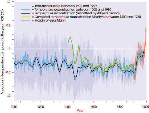
It was displayed in early IPCC reports untill it was finally omitted in the 4th report in 2007. The
inventor, Mann, obtained temperature data of earlier times from measurements of the growth
rings of trees. The graph came as a shock to the world. The
picture suggests strongly that at the moment mankind began to seriously consume fossil fuels,
the temperature on Earth started to rise dramatically. The black line is Mannís original
graph. The red line are instrumental data in the years in which direct temperature recordings
existed. They confirm Mannís tree data.
However, shortly after Mann published his findings, McIntyre and McKitrick checked Mannís
sampling technique and his statistical method. They found serious faults with both. Did
this shake up the climate alarmists? Not at all! Mann refused to disclose his original data and the
two critics encountered serious
difficulties in getting their work published. Journal editors believed in the infallibility
of the hockystick2.
The IPCC repeated Mannís graph in subsequent reports. But in science
ultimately the truth prevails. The mistakes became known nevertheless and the believers had
to step back. McIntyre and McKitrickís results are drawn in green. They show the higher temperatures in the Middle
Ages ñ well known from historical sources, like wine production in the UK and The Netherlands
for instance, or green Greenland explored by the Vikings. They also show the so called
ëLittle Ice Ageí (LIA) around 1700, known from Dutch paintings
among else. Last year there was an interesting confirmation from the seabed near California
were diatoms showed a co-occurence of the LIA, out there in the same period. It
blew away the argument cherished by the alarmists: that the LIA was only a regional European
anomaly. The corrected graph shows that present day temperatures are by no means as exceptional
as the climate change adepts made us believe. In fact temperatures in the Middle Ages
were higher than they are now.
Geologists were not surprised. There are means other than trees to measure temperatures and
also CO2-concentrations. One can drill holes in big ice
cores on Antarctica or on Greenland and from the air enclosed in small bubbles one can derive
temperatures and atmospheric constitution data prevailing there at earlier times. The IPCC
itself has published a graph based on geologic measurements of temperatures,
CO2 and methane
over a geologically relevant period. I show it here:
-2.gif)
What one sees here are a series of ice ages followed by brief ëinter glacialsí. We live in the
last of them since about 15000 years. Note that in the distant past there were no humans who burned fossil fuels.
There is another thing that sets serious doubts about the hypothesis of man made global
warming. Not only are the temperature ranges on a geological scale much greater than the
temperature change we are discussing (12 ñ 15 oC against
0,6 oC now) but also, if one takes a closer look at the
time resolution, we see that in the past, temperature rise and fall preceded the rise and
fall of the CO2ñconcentration! This fact is consistently
overlooked or left out by the environmentalists and the IPCC-lobby. It seems that the rise
of temperature triggers an increase in the concentration of greenhouse gasses.
There is a simple physical explanation for this observation. The solid and liquid surface
of the earth and its CO2-content is in chemical equilibrium
with the atmosphere. If you put more CO2 into the atmosphere,
the equilibrium is disturbed and the liquid and solid earth absorb so much of the gas till a
new equilibrium at slightly higher concentrations is reached. One should keep in mind, that
the mass of the atmosphere is small. It amounts to 1 kg above every square cm of the earthís
surface. If you look at the oceans, about 2/3 of the Earth's
surface, you only need 10 m of water to have the same mass. So solution in the
oceans of a few more ppM of CO2 is not a big deal.
(Apart from that, plants grow faster and so absorb more atmospheric
CO2 at higher concentrations.) The chemical equilibrium
between CO2 in the gas phase and
CO2 in solution in water shifts if one changes the
temperature. Higher temperatures mean less solubillity in water. So, with increasing
temperature the oceans give away part of their
CO2 contents to the atmosphere. In the past this is, what
has happened. That is why in the 400 000 year graph the greenhouse gasses oscilate with
temperature ñ but in fact with a little time difference, temperature change comes first!
If the temperature on Earth regulates the amount of CO2 in the atmosphere, does that mean that CO2 has no effect on temperature at all? The answer is: certainly not; it does have an effect. In the beginning I told you that without the greenhouse shield temperatures on earth would be about 34 oC lower than they are now. Of this difference, we estimate that about 9 oC can be attributed to CO2. However, that does not mean, that if one doubles the amount of CO2, the temperature increases with another 9 degrees. In fact it has been shown by Nir Shaviv (Israel) that doubling of the concentration would raise the earthís temperature by a mere 1,2 oC. It is in fact a logarithmic function. This means, that for every 1,2 degree of temperature increase one needs to double the amount of CO2. This is the case in the concentration range with which we deal. So our greenhouse gas gives a positive feed back to the heating process, but that does not mean that it determines the temperature. If that were the case in earlier interglacials the temperature would have continued to rise and by now we would all be boiling.
Let us have a closer look at atmospheric CO2. There is about 750 Gton (gigaton) of it in our air. Each year nature puts in about 150 Gton and at the same time takes out about the same amount.
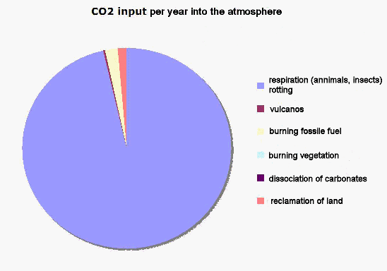
The slide shows the sources of CO2ñinput. Burning of fossil fuel adds about 4% to the input. Flying insects, by the way, put in about ten times more than mankind with all its machines. What happens to the about 6 Gton we bring into the atmosphere? I told you already, that the amount of CO2 in the atmosphere increases. The increase is about 3 Gton. So half of what we add is already absorbed by earth and oceans in the same year.
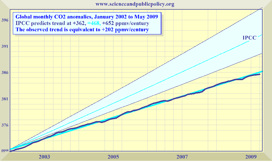
If we compare the actual ñ measured ñ CO2-increase in
the atmosphere with the predictions of the
IPCC, we see an interesting discrepancy. It is just one of many such discrepancies. The IPCC
uses so called climate models, computer simulations of the processes influencing the climate.
Time and again they have had to change the parameters steering those simulations in order to
fit the outcomes with the measured data.
As I said before, the chemical equilibrium between air, soil and oceans ultimately rules the
concentration in the air. The relative tiny bit which we add might even disappear almost completely
if we would wait a little longer. The relaxation time, that is the time necessary to reach
equilibrium, is longer than a year; probably around 10 ñ 20 years. Therefore I expect the
growth curve to level off, contrary to the bending upward in the IPCC models. If the slope
of the line would remain constant as it looks from the measurements and if the increase would
be our doing and not due to an equilibrium shift from other natural causes, it would take
> 200 years for us to double the atmosferic CO2-content,
and thus to raise the temperature by 1,2 oC.
Why is the IPCC then so alarmed? And why do they warn for a temperature rise of
some 5 oC? The relevant atmospheric processes are poorly
understood. The IPCC assumes that the increase in temperature will cause an increase in
other greenhouse gasses. A warmer earth will evaporate more water. Thus more water vapour
in the atmosphere, causing more warming up etc. Another assumed positive feed back. But
more water vapour means also more clouds. And clouds reflect the incoming sunlight before
it can heat up the earth. So there are arguments as well, to predict a cooling effect!
The previous interglacials in which the CO2-concentration
also became high, were not extended by this feed back phenomenon. Why would
it occur now? As I said before, the climate models have no realistic physical basis
especially when the role of water is considered. Heat transport from the equator to
the poles, heat transport by evaporation and condensation, adiabatic atmospheric
processes and major regulating effects except those of radiation are all neglected. The
models are highly speculative. I think it unwise and certainly unnecessary for
governments to base their policies on such inadequate computer games.
Let us have a look using a magnifying glass at the temperature again.
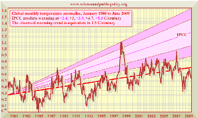
During the period 1981 ñ present there is a steady increase in temperature. The trend is 1,5 oC per century. The expectations of the IPCC are more dramatic. They predicted 2,4 ñ 5,3 degrees increase in the same period. The measurements show lower temperatures than that. The funniest part, however, is that in the last 9 years we have seen a decrease in global temperatures.
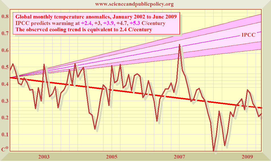
In this graph we have left out the El NiÒo peak of 1998, as that is clearly a singularity, a unique event, which has little connection with the processes we are discussing here. But even without that we see a downward in stead of an upward trend with temperatures significantly below those predicted by the UN climate panel. Looking at this picture, I suggest, if you do own a fur coat, donít throw it away. Your grandchildren might need it.
A major and fundamental blow to the IPCC hypothesis of a warming earth caused by an increased greenhouse effect, came recently from satelite measurements. Remember, IPCC supposes: more greenhouse gas absorbs more outgoing radiation from the earth and keeps more warmth in the system. The subsequent models used by the panel and by some independent modellers invariably showed a diminishing amount of long wave radiation leaving the earth towards outer space.
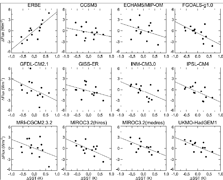
The picture setts off scatter-plots of net flux of outgoing long-wave radiation. The
upper left panel shows the measured values of the satellites of the Earth Radiation
Budget Experiment over a 15-year period. The others are graphs as predicted by 11 of
the computer models relied upon by the UN (and others). All against anomalies in global
mean sea surface temperature over the period.
The mismatch between reality and prediction is entirely clear. It is this astonishing
graph that provides, I think, final evidence that the UN has absurdly exaggerated the
effect not only of CO2 but of all greenhouse gasses
on global mean surface temperature.
If we have time at the end, I shall propose a possible new explanation for the
temperature changes we know about. There is growing evidence that the variations
are due to solar processes.
But let me first deal quickly with some scary consequences of global warming against
which the IPCC rings the alarm bell.
The IPCC and mr. Al Gore warn us, that the sea will rise. The latter predicts 6 ñ 7 m
during this century. This would be a disaster for The Netherlands, of which now already
40% lay below sea level. But also the inhabitants of London
would be wise to move, or to have a life boat somewhere in the attic. In 2001 the IPCC
prophesised for this century a rise between 9 and 88 cm. In 2007 it had narrowed the
range to 18 ñ 38 cm if the world would seriously reduce its
CO2ñproduction; or 26 ñ 59 cm if the greenhouse gas
emission is not reduced. The Netherlands Meteorological Office warns, that if the ice
on Greenland would melt, the rise could be between 1,5 and 3 m! And if also the ice on
Antarctica would melt, they join Al Gore and predict 7 m.
Let us take a look at the world before man started to interfere.
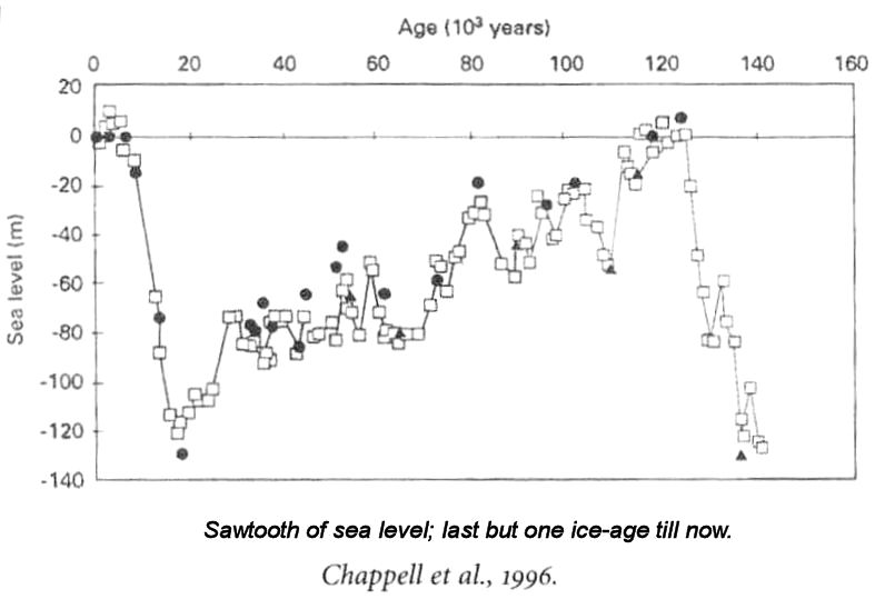
Here is a graph taken from the geology textbook of Kroonenberg. During the last ice age, some 15000 years ago the sea level was about 120 m below todayís. 10 000 years ago people lived on the Dogger Bank in the midle of the North Sea. The British did not need a ferry, if they wanted to visit the continent. They lived on the continent! One could walk from the place of present day London to that of Amsterdam. As you see in the aftermath the sea rose steeply sometimes with 1,5 m/century to its present day level. The geological data have been refined by combining different methods.
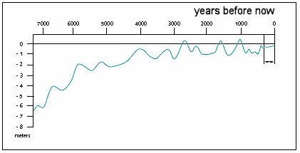
The result is this picture, which shows that the rise is levelling off. For the last century we have the concise measurements of the 'Netherlands Rijkswaterstaat', certainly one of the most reliable and conscientious collectors of such data in the world. Their findings can be seen here:
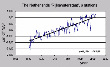
Funnily enough, in an accompanying note, Waterstaat states, that it ëregrets not to be able to confirm a faster rise of the sea level. It remains a steady 18 cm/century.í I present their data with confidence. These are the facts. No need to start a new crash dike building program. With the present maintenance routine we can easily stay ahead of the developments.
For the dwellers of atols in the Pacific there is also good news, see the next slide.
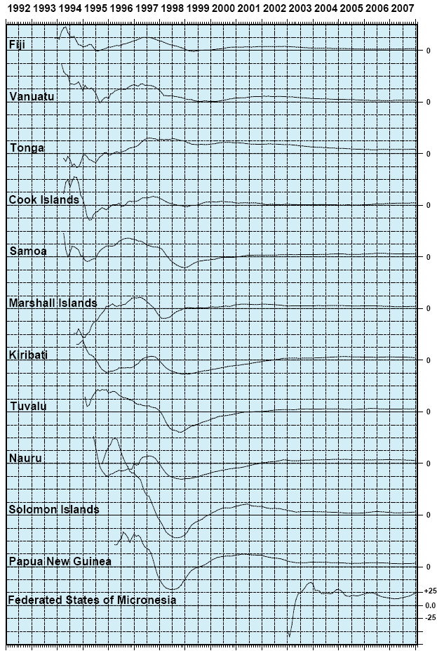
No reasons for panic as you see. In the beginning of the measurements there is some turbulence. It is normal for new measuring sites. People have to fix and adjust the instruments. They have to learn how to use them. But after the human learning curve the sea becomes stable (!).
In order to justify the alarm signals, the climate change adepts have come out with panic stories about melting polar ice. Well, what are the facts? Here are the most recent measurements of the surface area of Antarctic ice:
Surface Area of Antarctic Ice
As you see there is a big seasonal variation, but the general trend is a slight extension of the Antarctic ice area. (Antarctica contains about 80% of the world's ice stock.)
The situation in the Arctic region also does not show appreciable changes.
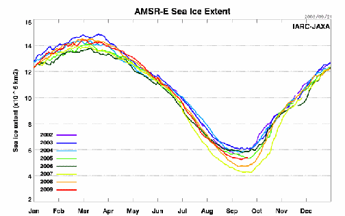
In 2007 and 2008 at the end of the summer the area had diminished compared to previous years. It reached its lowest size in 30 years; but a few months later everything was back within the normal range. The only remarkable thing was, that the downward fluctuations received wide press coverage, while the fact that at the very same moment the area of Antarctic sea ice reached a 30 year high was neglected by the public news media. Consequently people become worried. A few months later the situation in the Arctic returned to its normal state, which was barely reported either. As you see, this year, 2009, the red line, the arctic is back to its 30 year average.
A final comment about one other behaviour of nature that drew much attention and was widely communicated as a warning signal by the climate alarmists. ìThe glaciers on the mountains of the Northern hemisphere are shortening.î Here they do seem to have a point as the slide shows:
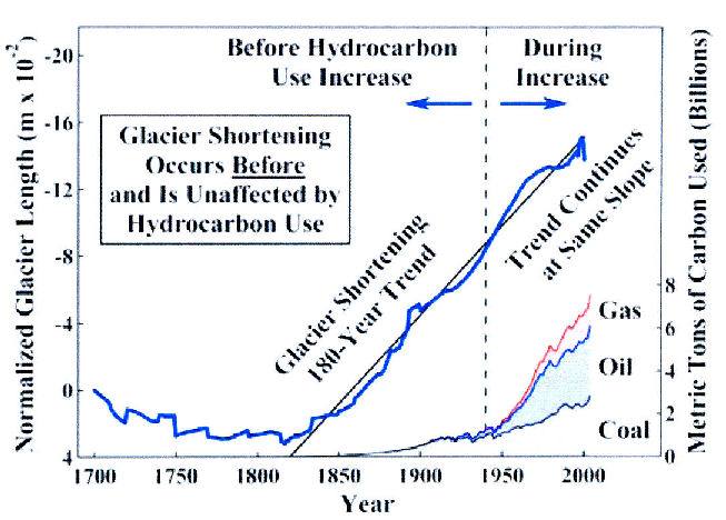
The shortening of glaciers in the Northern hemisphere is an uncontested truth. But it does not hold for the Southern hemisphere. Glaciers in New Zealand, for instance, are growing. Also interesting is the fact that the shortening of the glaciers began and was well underway before mankind started to feed extra CO2 into the atmosphere! When we did that, the shortening of the glaciers continued with the same rate. Was there no heating effect? To be honest, we do not know. Glacier length is not determined by temperature alone. Precipitation is also important and as yet we do not have data to tell us whether the mountains have become dryer than before or not.
My conclusions about climate change are:
There is no scientific proof of antropogenic heating.
CO2-emissions do not contribute significantly to
the earthís temperature change.
Sea level rises gently, as it has done the last century; long term observations
only indicate this phenomenon to level off.
There is no reason for costly, draconic governmental action.
If my arguments have not convinced you right away, that I am right and the
man-induced-climate-change people are wrong, I hope at least, that I have not bored
you and that I have given you some facts and thoughts that you may consider worthwhile.
Thank you for your patience3.
-o-o-o-o-o-
Discussion
During the discussion I elaborated somewhat about:
- sunspots
- hurricanes
Sunspots
For quite some time scientists could not explain why in relative short periods the
temperatures on earth went through appreciable changes. The mechanism of the ice ages
and the interglacials is rather well understood. They are ruled by the change in
elepticity of the earthís orbit, the Milankowitch cycle, with some influence of the
precession of the earth axis. The effect thereof are longer summers and shorter winters
during interglacials and the reverse during ice periods. But how could, for a
century or so during the Middle Ages, the temperature rise by several degrees? And how
could a rapid cooling occur during the ëLittle ice ageí around 1700 with subsequent
warming up till now? We have no clue about the sun radiating more or less heat. In fact
the sun is a very stable heat source whose fluctuations are so small, that they cannot
be the cause of these effects. We knew about ësunspotsí that occur both, irregularly and
at regular intervals. This peculiar solar activity seems to correlate with mentioned warm
and cool periods. However, very precise measurements have shown that sunspots do not
affect the radiation flux of the sun enough to explain such phenomena on earth.
It is only during the last few years that we became aware that the sunspots do have an
indirect effect. It is not that they change the irradiation much, but they represent huge
magnetic disturbancies. And those disturbancies are shielding off to some extend the
eternal steady bombardment of the earth by cosmic rays. Cosmic rays are particles that
reach the earth from all directions of the universe. The hypothesis with which astronomers
came up is: Variation of the intensity of cosmic rays causes variation in cloud formation,
because the number of particles in the atmosphere that trigger condensation changes.
During recent years this sunspot activity has decreased and at the moment it is lower than it
appears to have been ever. In the words of Kees de Jager, a Dutch atronomer:
ìAt present, the sun is absolutely dead.î
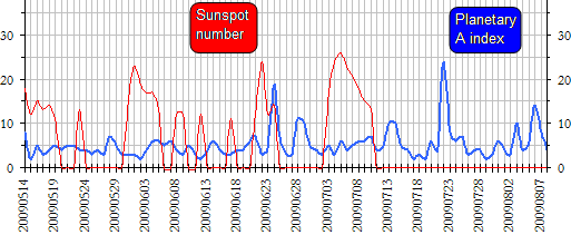
During the last few months, sunspot activity has been appreciably lower than in the last decades of the
20th century. Presently the activity is nihil. That means: less magnetic shielding
→ more cosmic rays → more clouds → less incoming sunlight → cooling.
Svensmark, who was one of the first to come up with the sunspot hypothesis, has commented:
ìThe effect of the solar explosions on the Earth's cloudiness is huge. A cloud loss of 4 or
5% may not sound very much, but it briefly increases the sunlight reaching the oceans by
about 2 Watts per square meter, equivalent to all the ëglobal warmingí during the 20th Century.î
The significance of Svensmarkís results is considerable. His work establishes that small
changes in solar irradiance reaching the earth, persisting over time, can cause substantial
changes in global mean surface temperature. The UN had assumed the Sunís influence was
negligible. The UN, it seems, was wrong.
If this new theory proves to be correct, the leaders of the 8 biggest industrial countries,
who ordered: ìThe earth must not heat up more than 2 degrees.î will have to command the sun
to behave better. That is, if they want their statement to be effective.
-o-o-o-o-o-o-
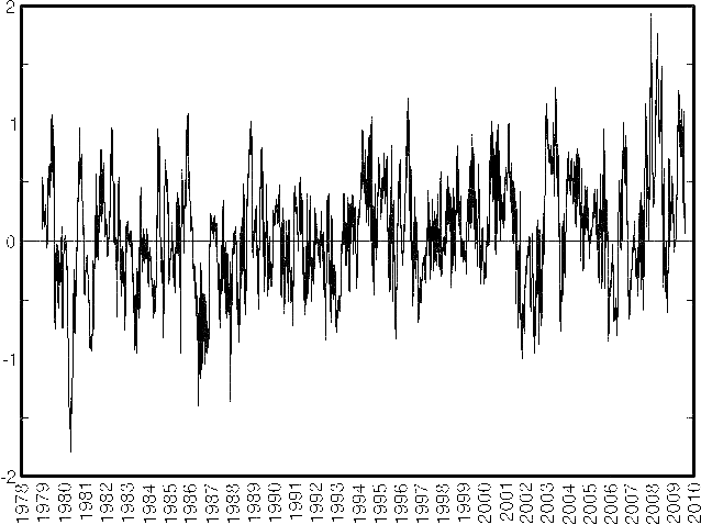
Cyclones
In ìMy Fair Ladyî Eliza Doolittle sang:. ìíUrricanes íardly hever íappenî. She was a smart girl.
Hurricanes, typhoons, and other tropical cyclones have declined recently, in contrast to what
some climate change advocates preach.
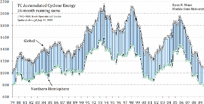
Global activity of intense tropical storms is measured using a two-year running sum,
the Accumulated Cyclone Energy Index, now standing at almost its lowest value in 30
years for the Northern Hemisphere, but also globally. The graph shows the 24-month
running sum of tropical-cyclone energy for the entire globe
(top) and the Northern Hemisphere only (green). The difference between the two time
series is the Southern Hemisphere's total. Data are shown from June 1979 to May 2009.
(Intensity estimates of southern-hemisphere cyclones are often missing before
the start-date of the graph.)
Source: Ryan Maue, July 2009.
As you see, there is no reason for alarm. There is no indication that the hurricane
pattern has changed during the last decades.
Notes and references
Mann refused to disclose his original data
to McIntyre for about a decade. The data finally became public in 2008 (!). Briffa was forced by the Royal Society
to show them, when he published his research in the 'Philosophical Transactions'. 12 Ill chosen trees,
that shook the world!